rae
Sebrae
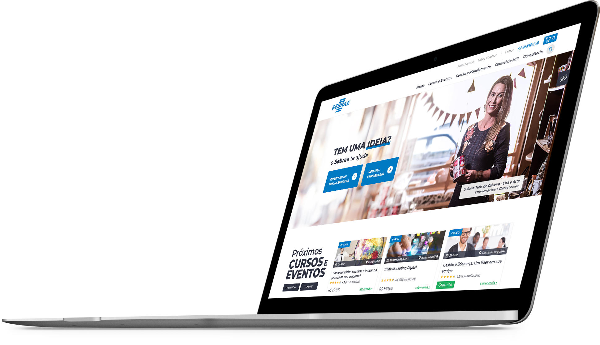
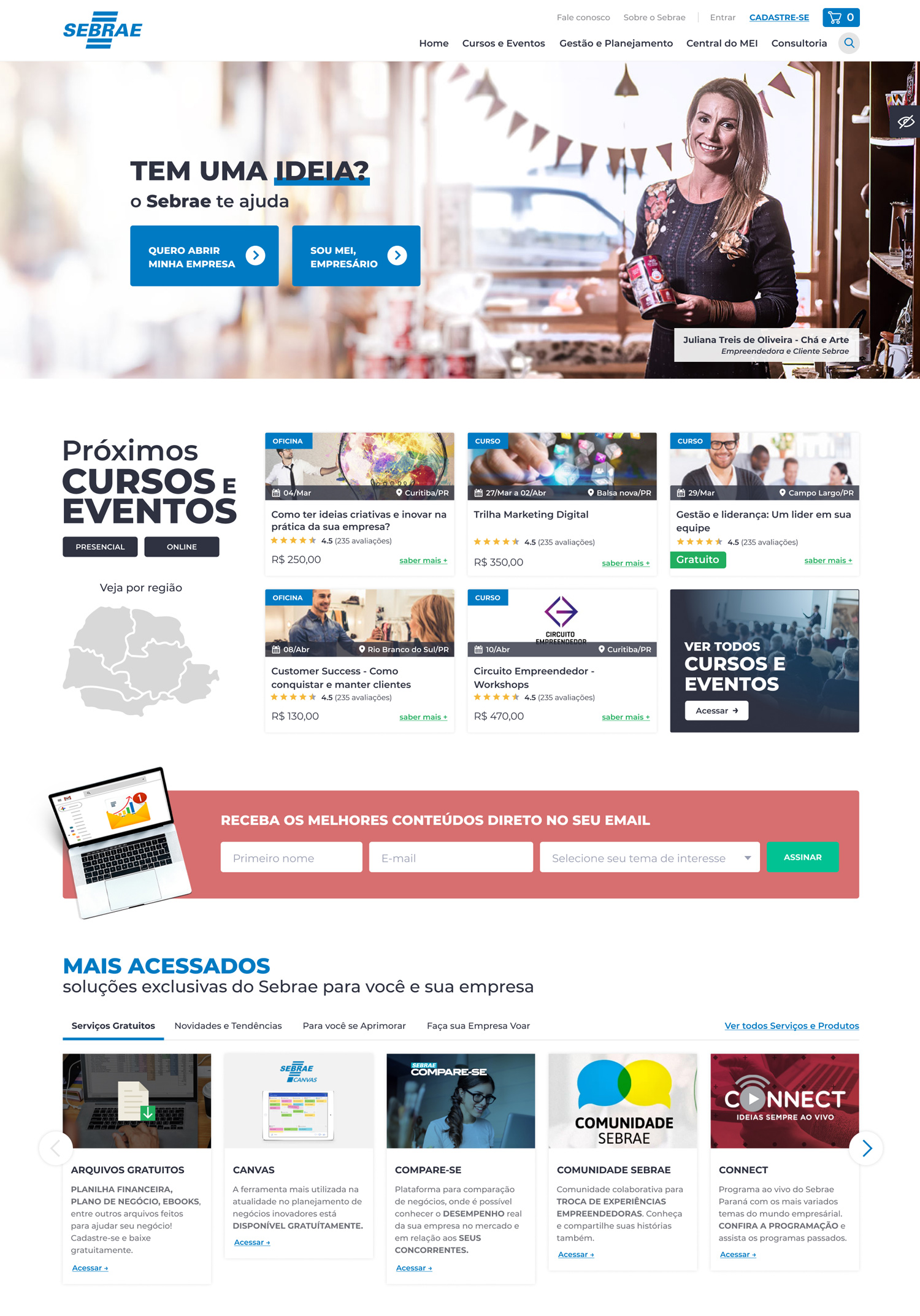
A content webportal combined with an e-commerce platform of courses, tools and services for entrepreneurs.
Jun_2020
Project Manager
Product Designer
Portal and E-commerce
Context
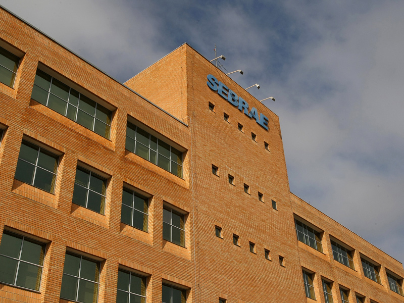
Founded in 1972, Sebrae is present in every state throughout Brazil, and focuses on fostering entrepreneurship across the country. As experts in sustainable and competitive small business development, Sebrae is the mecca for reliable information, guidance and services for SMEs.
So many years of history has led to a continuously updated portfolio of over 200 products, including business formalization, training, workshops, courses, consulting services and events.With a wide coverage of over 1800 offices across the country, the company's solutions have been predominantly delivered in a physical format.

Without a purpose
there is no story
Although Sebrae has an impressive market reach due to its large number of offices, it has been working hard to implement its digital transformation strategy. As an important part of the digital engine, my team is responsible for developing new fully digital and phigital (physical + digital) services and products.
As we began to develop new solutions, we noticed it was important to rethink the way the services were offered, therefore, we had to look into Sebrae’s WebPortal, The website receives, organically, millions of users per year, however, it does not cause a good impression when it comes to performance. Mainly due to the very poor usability, since users face too much content and lack of navigation clarity, making it difficult for people to find what they were looking for.
The process
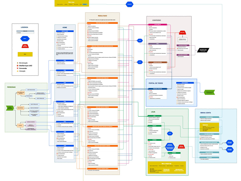
I was responsible for managing the entire process of rethinking from scratch the Paraná Portal , a platform that consists of 3 different parts: Content, Store and Logged Area. Below, learn more about the project stages.
Strategy and Research
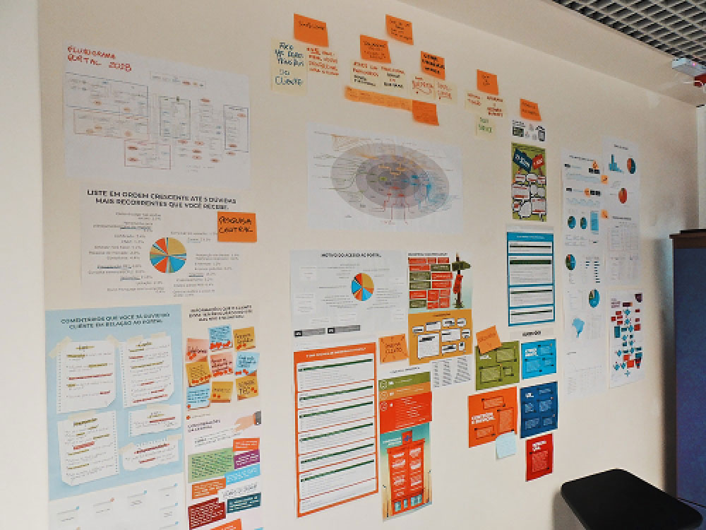
TThe project strategy was built on the definition of 4 business objectives. The goal was to transition the portal from a passive channel to becoming part of the company's business model. The next step was to identify and understand how people interact to the platform, not just the digital users but also customers who come to our offices, attendants and project managers.
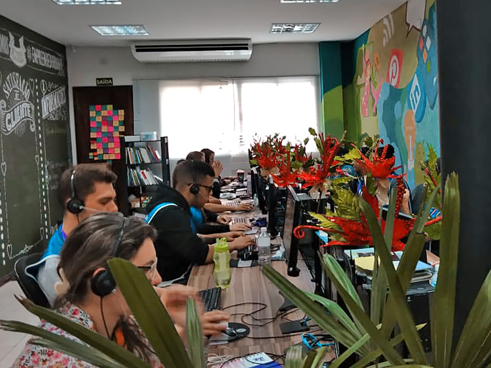
To identify all stakeholder needs, a set of qualitative surveys was conducted with more than 200 people from 3 different groups: customers, call center team and Sebrae’s employees. Once recorded, this information was cross-referenced with the 4 business objectives, becoming a database for insights and improvements. To finish the process, the user journey was designed, taking into consideration 6 different personas.
Ideation
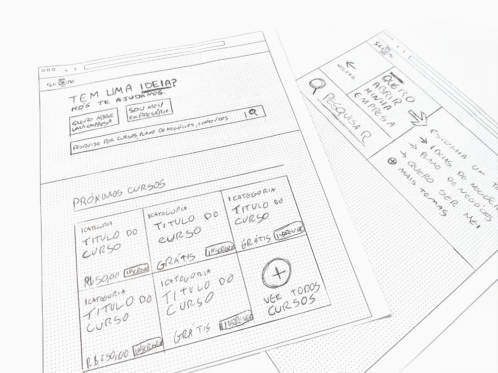
The first steps of the ideation stage comprised the CMS, layout sketches, and meetings with project managers, who would use this interface to communicate their projects to the business community.
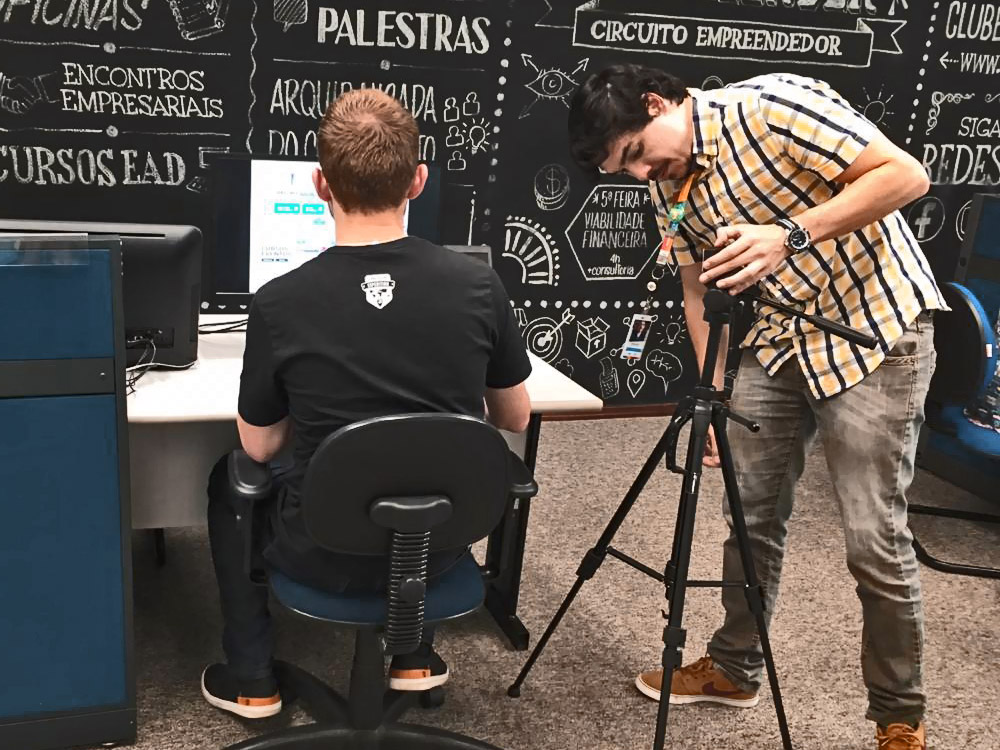
Further, with a high fidelity semi-navigable prototype, we conducted a usability test using the RITE method, which consists of implementing improvement suggestions from one tester before another trial, instead of waiting until the end of the test to gather the findings.
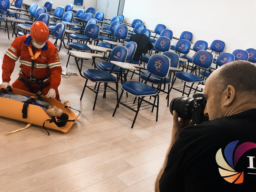
As a final touch, instead of using stock photos, we decided to use real Sebrae clients to illustrate the homepage, inviting them to an exclusive photoshoot at their own establishments. The goal was to humanize the portal by bringing real customers as social proof, also becoming a recognition action for successful clients.


Development
The development was handled by a third party company, under my management. In this role I was responsible for the briefings and homologation of the sprints.
The main difficulty in development was due to the fact that the content part of the site was built on Wordpress, to allow the team to create custom web pages while not requiring any coding or special development, and the part of the store and logged area was in Angular, however, both interfaces required exchange of information between them.
Content
To keep content aligned with Sebrae´s social mission and relevant to the consumer, we have hired a specialized content and SEO agency to step up the publications and set up metadata to reach a better ranking on searching engines. We have managed to publish more than 700 contents, against over 180 from the previous website.
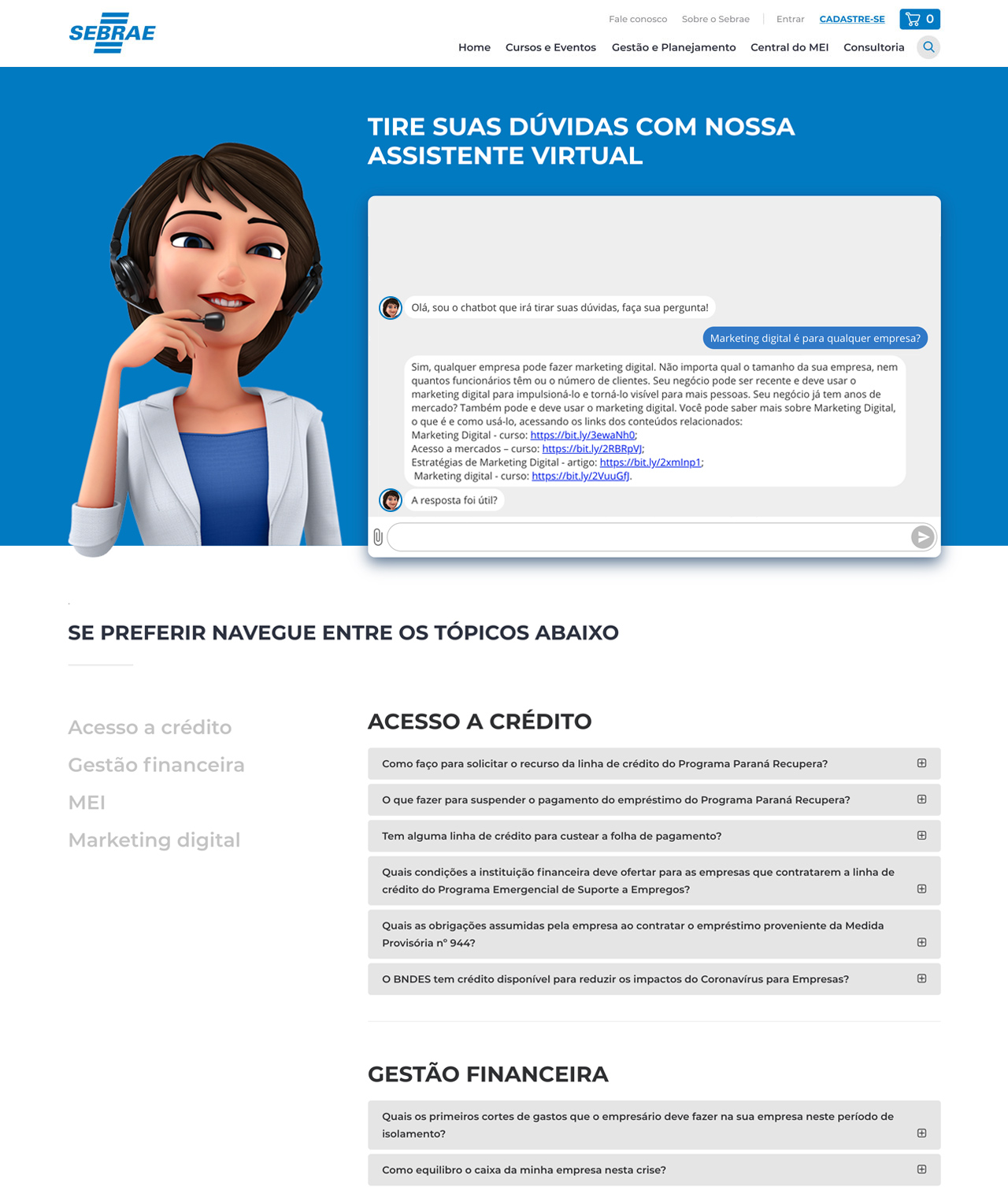
Part of the customer support is carried out by the call center. In order to automate part of this process a chatbot was deployed to solve common issues, without the need of human assistance.
Outcome
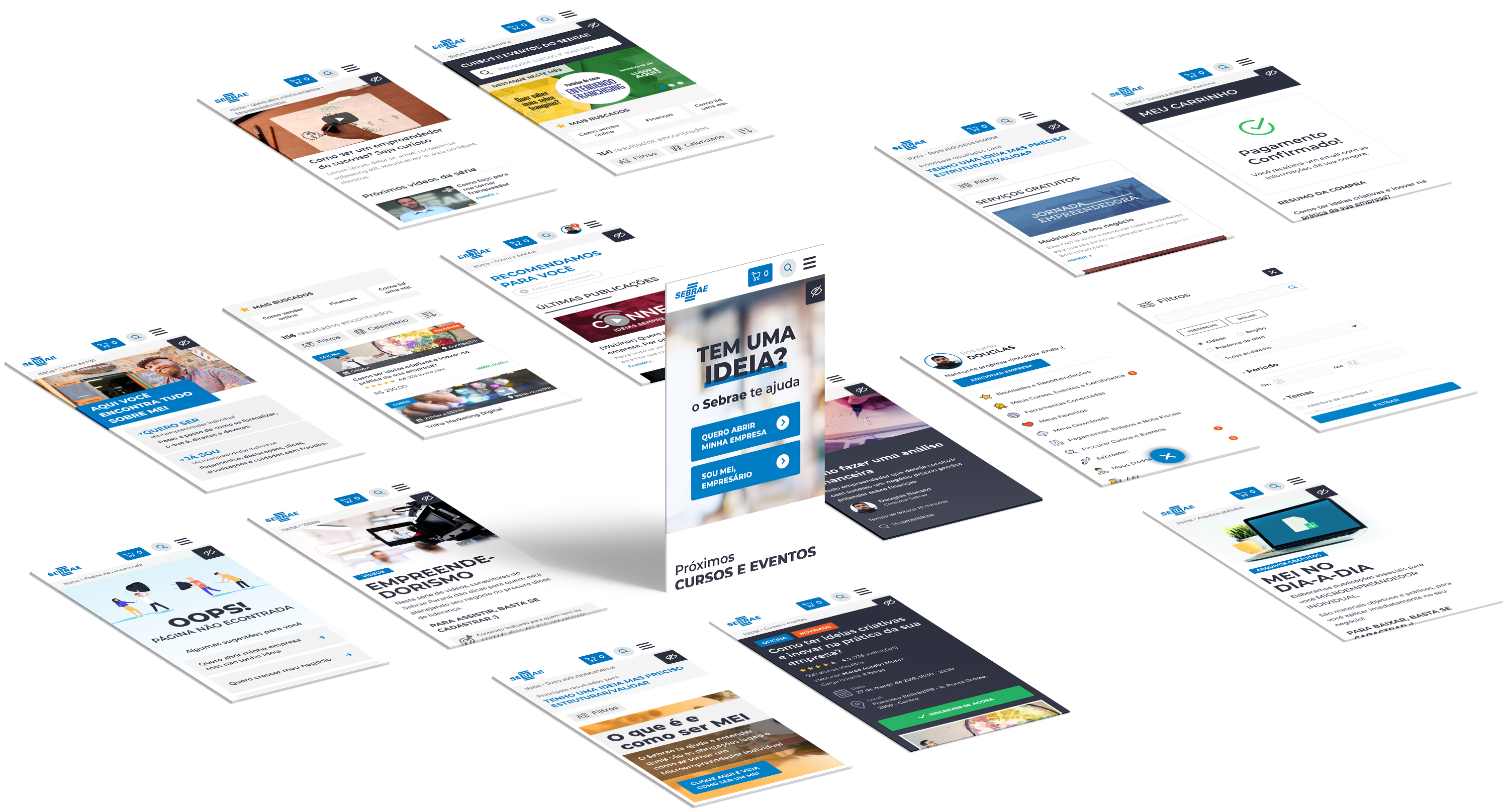
Microinteractions
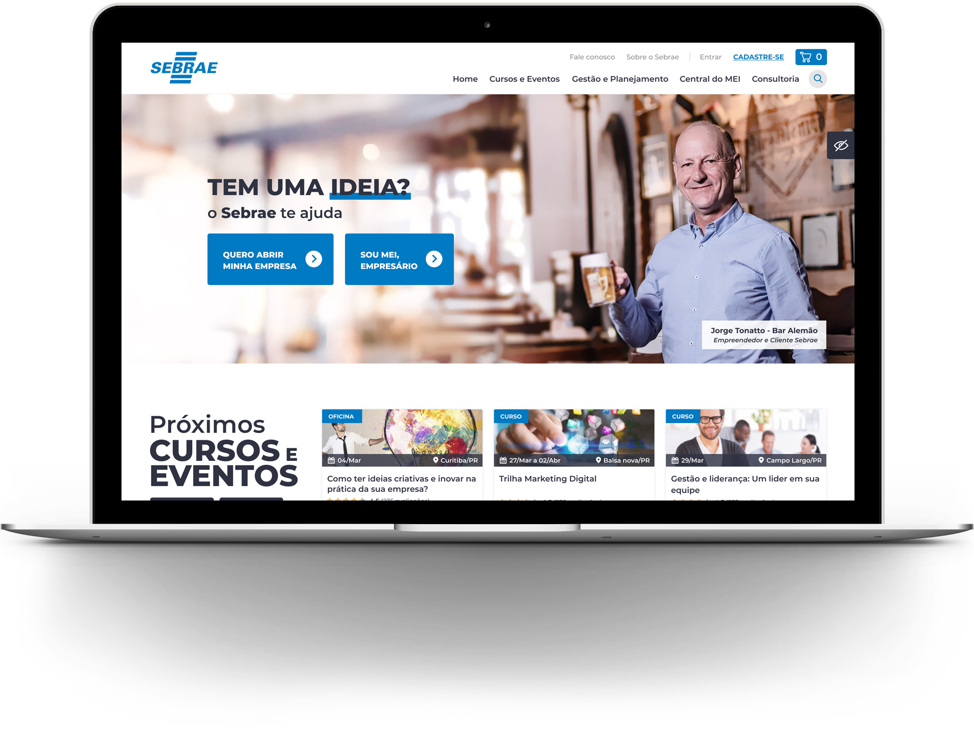
Showing attention to detail, we developed some feedback animations throughout the website, already in the first seconds, offering a modern experience to the user.
Content
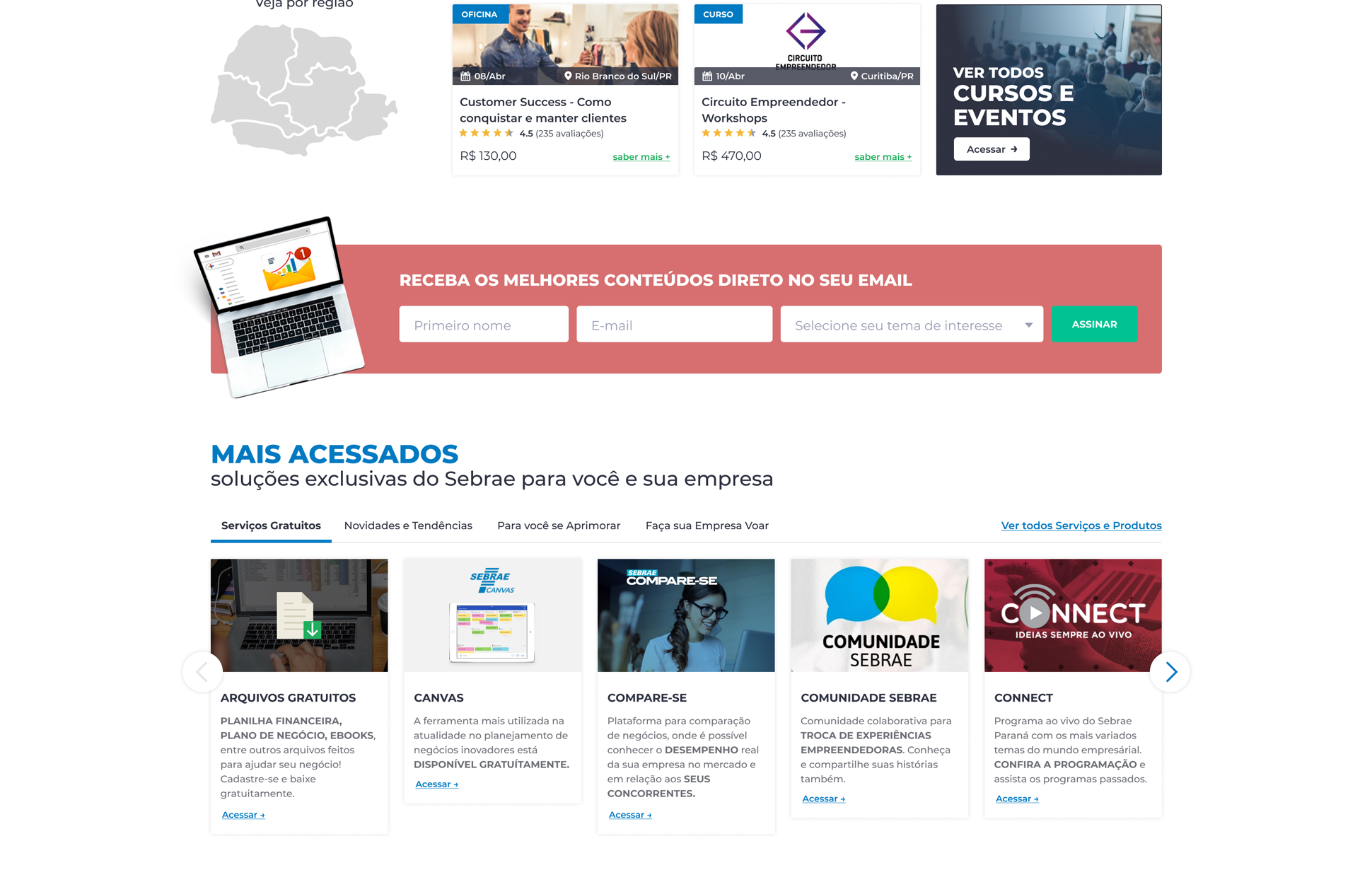
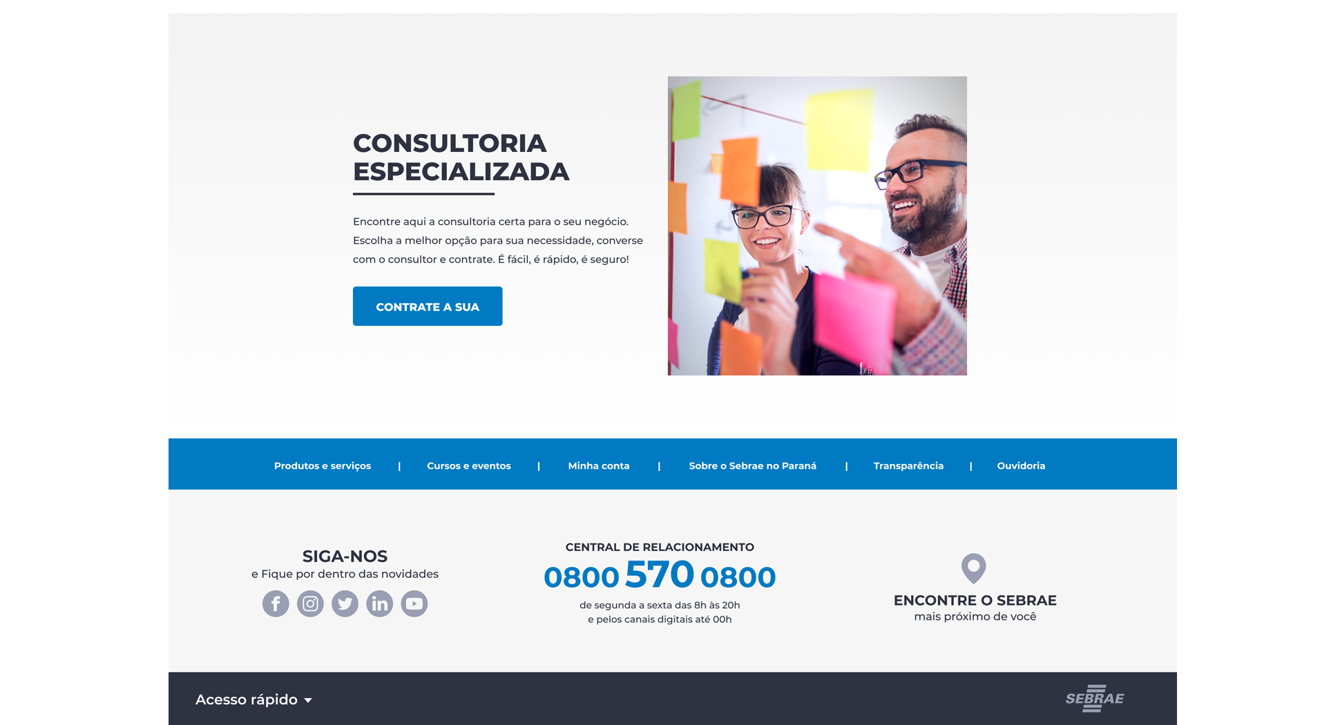
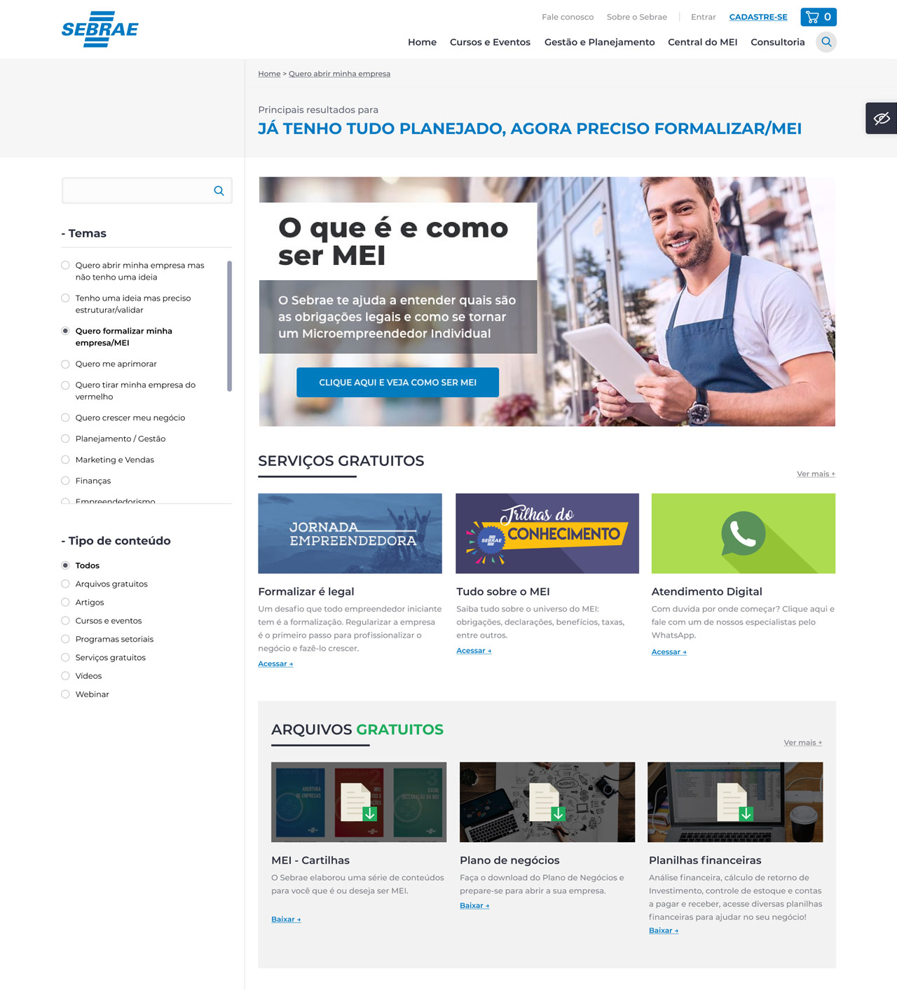
Some of the new content pages features
Results
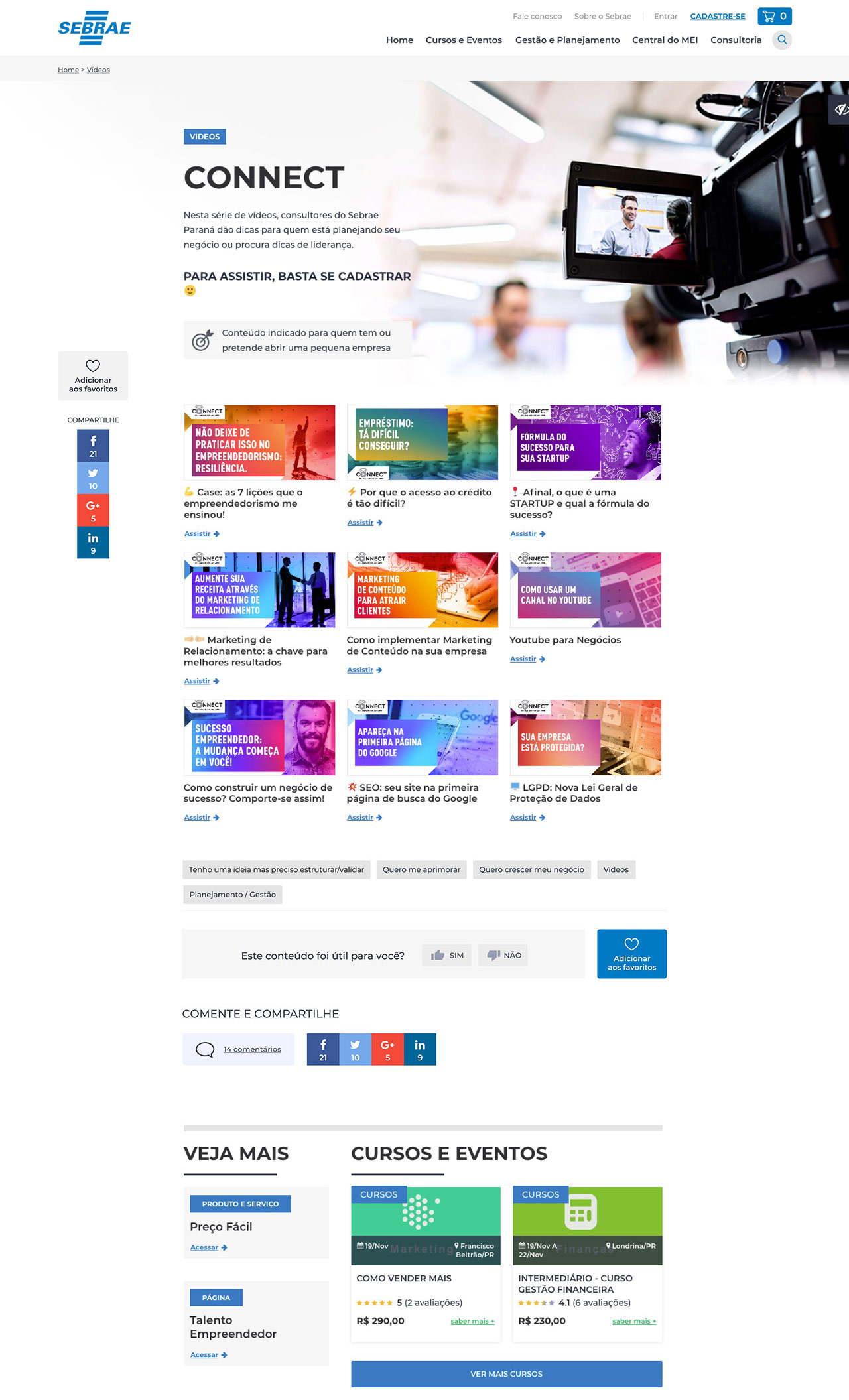
Video Series
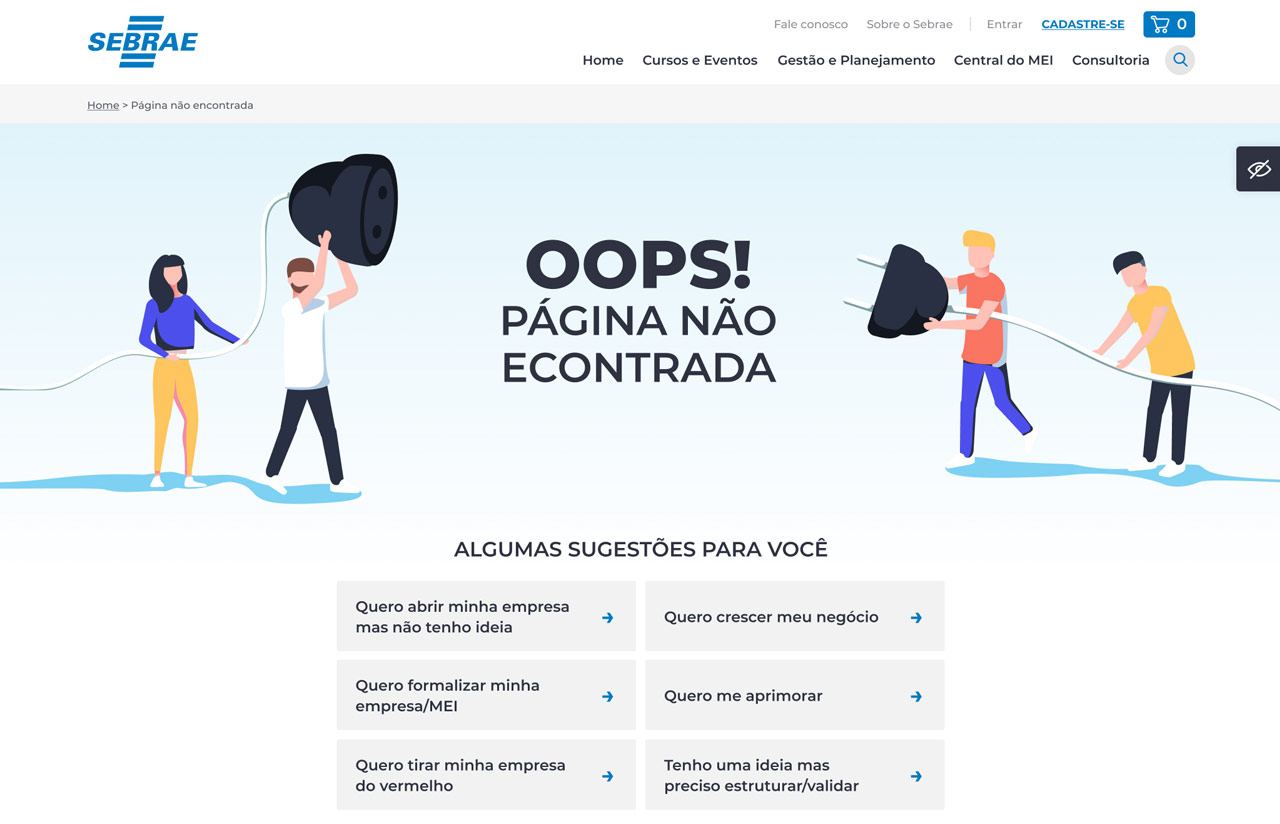
404 page
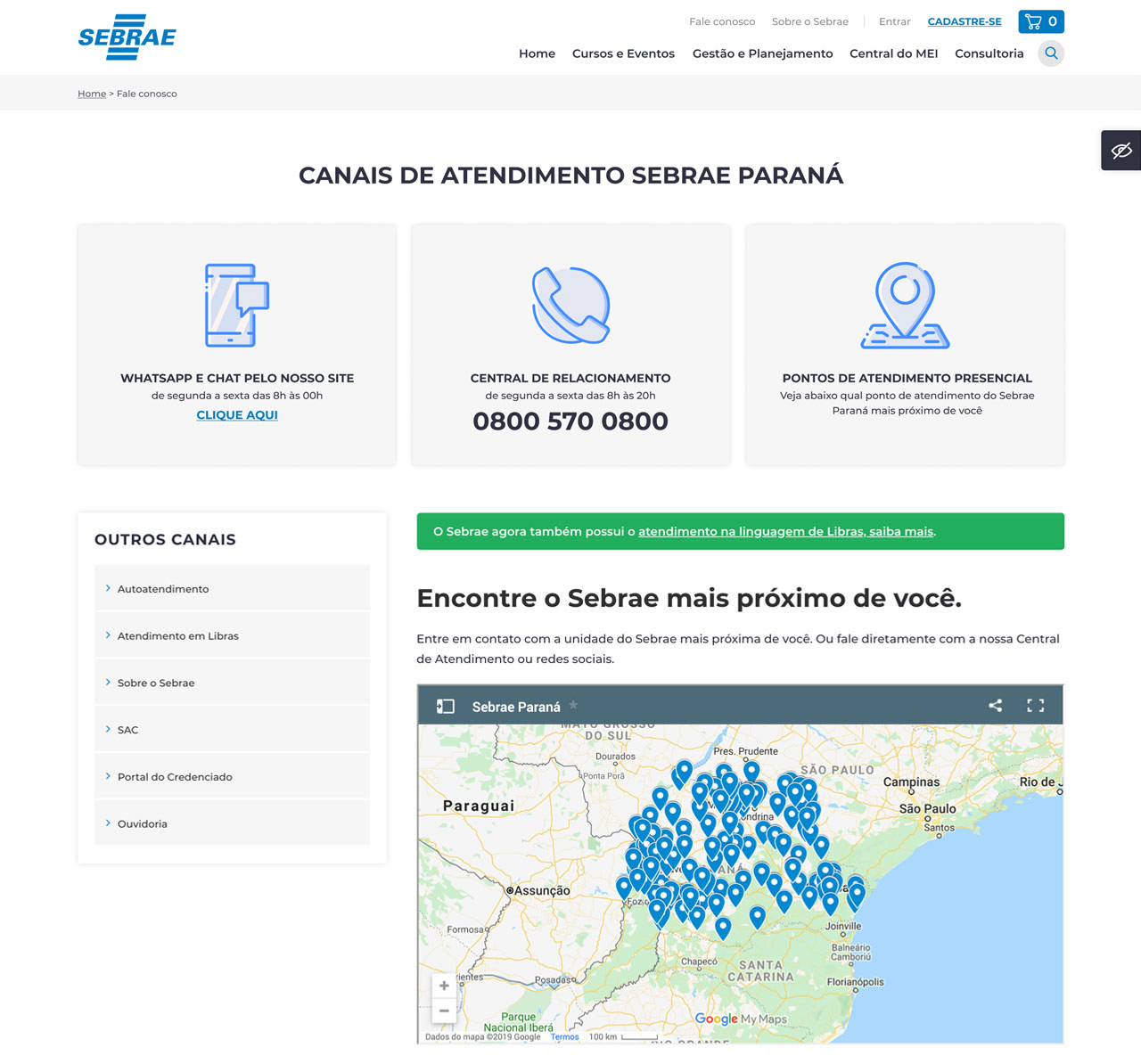
Contact
FAQ with Chatbot
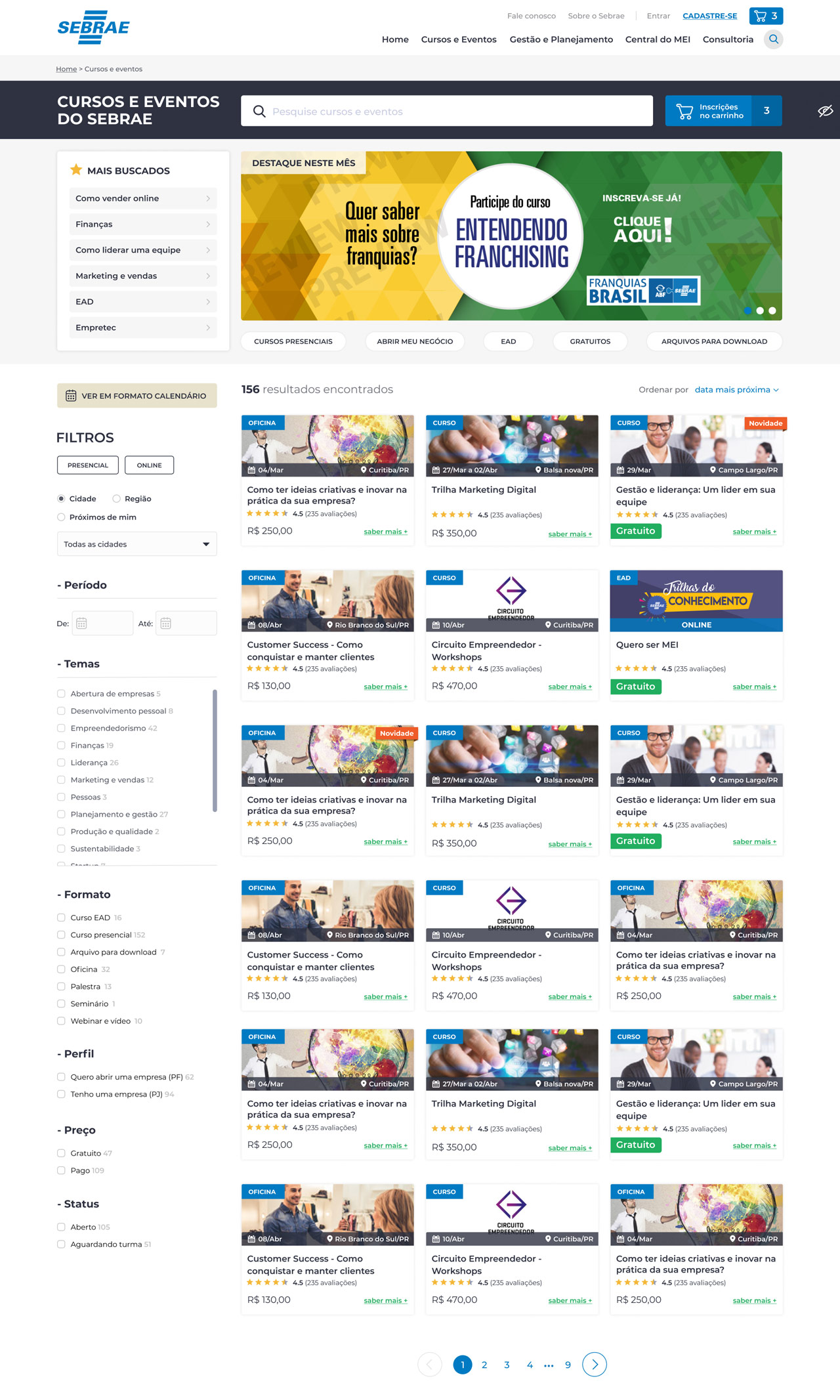
E-commerce
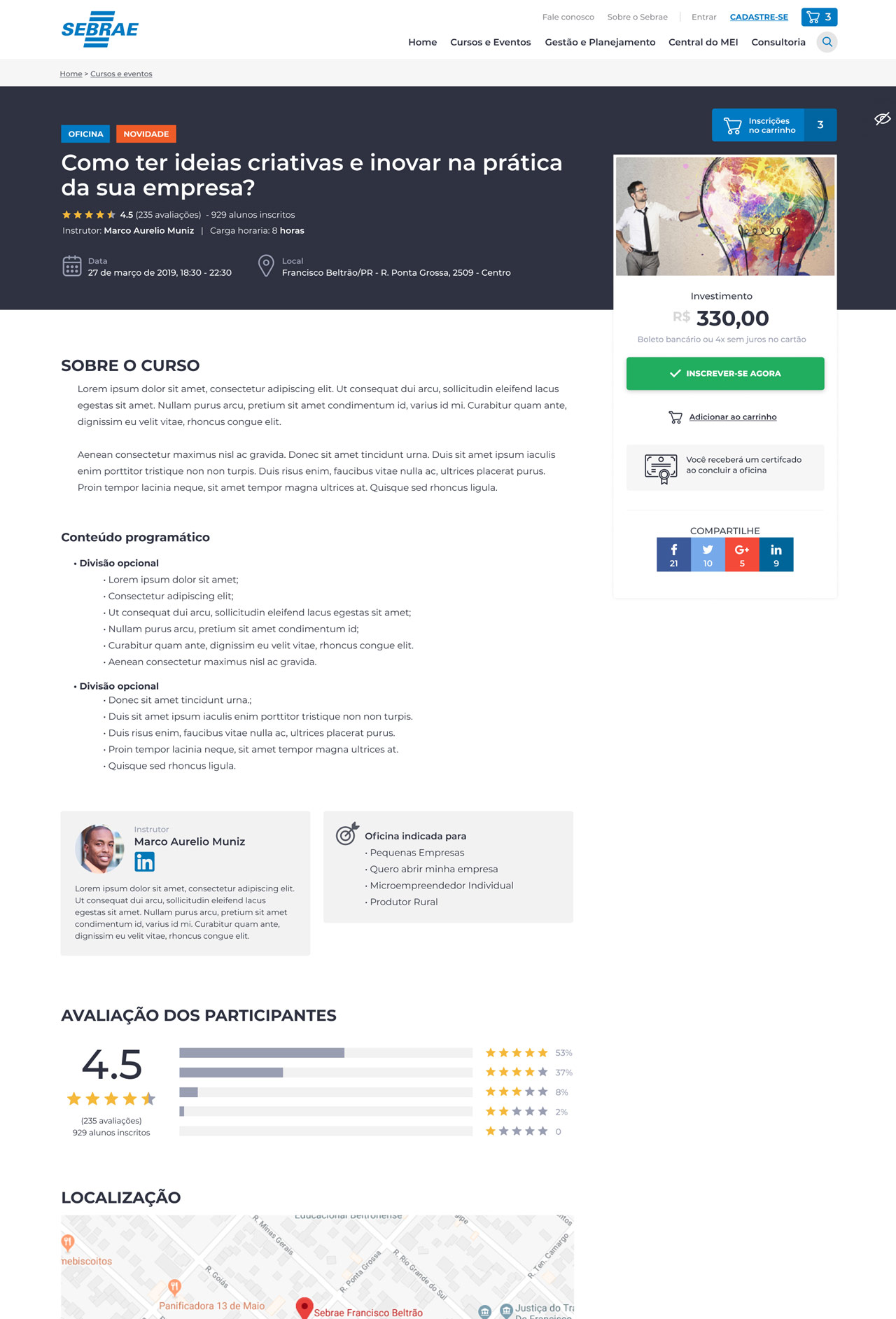
Some of the new store pages features
Store home
Product
Calendar view
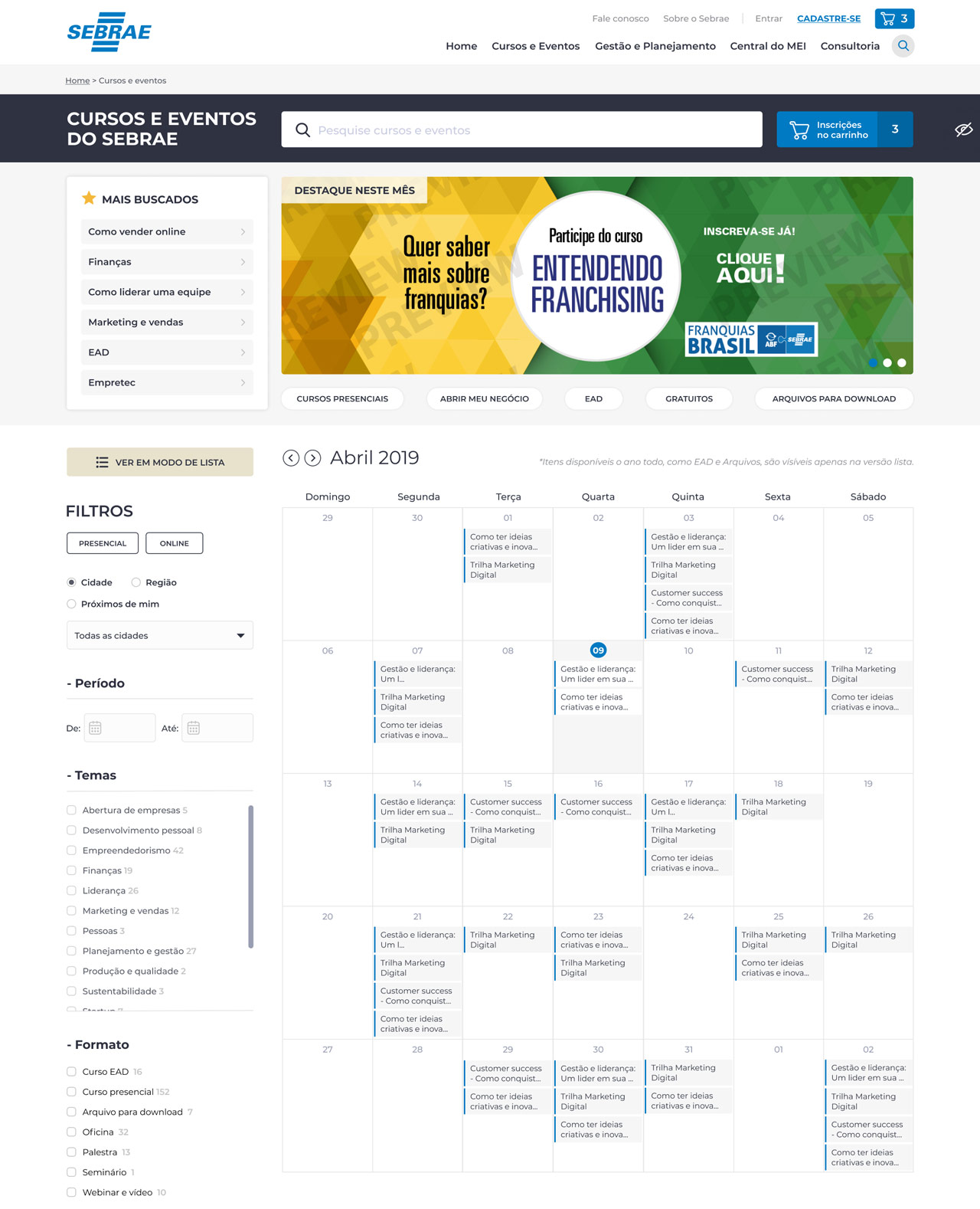
A big request.
Checkout
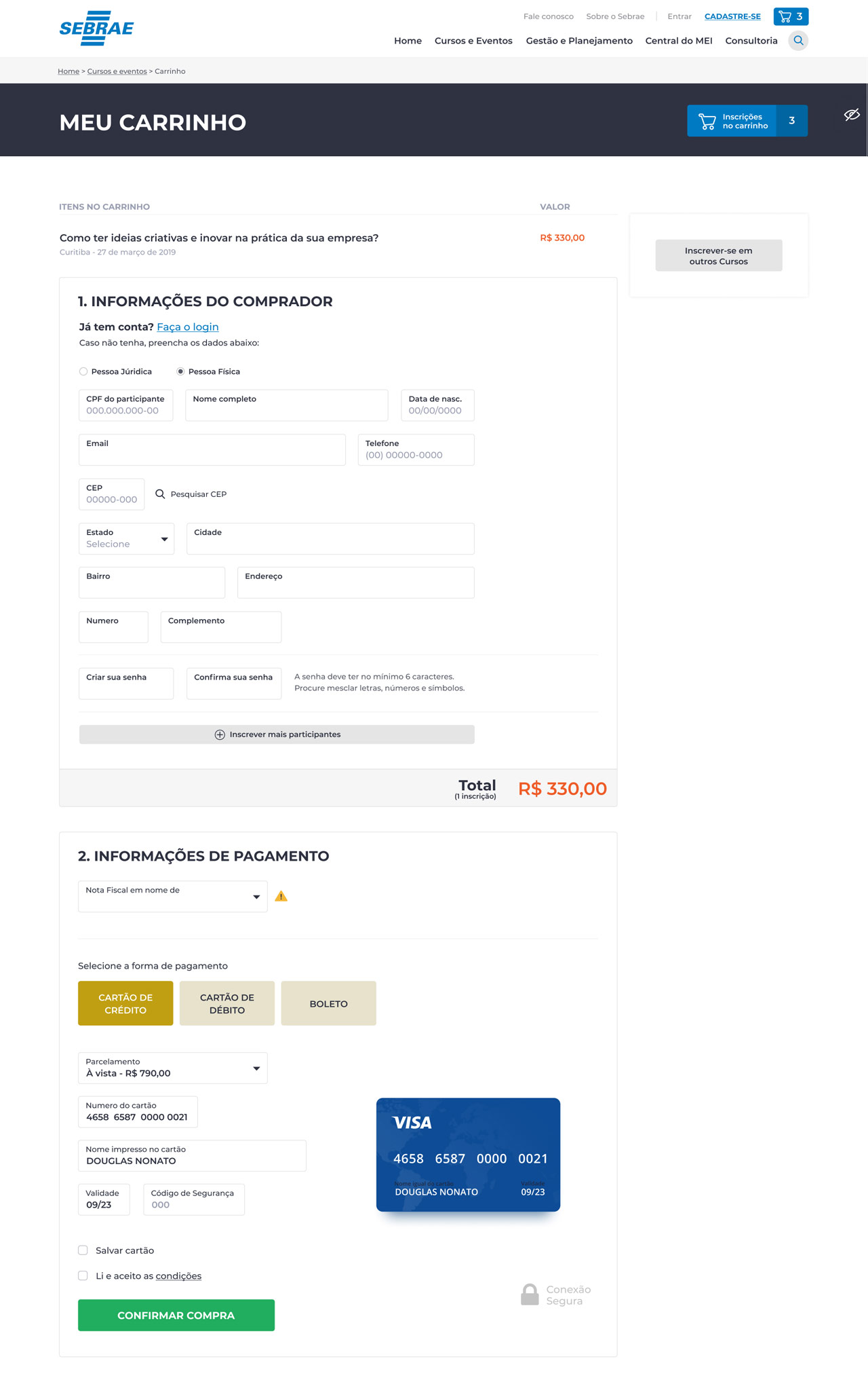
Account
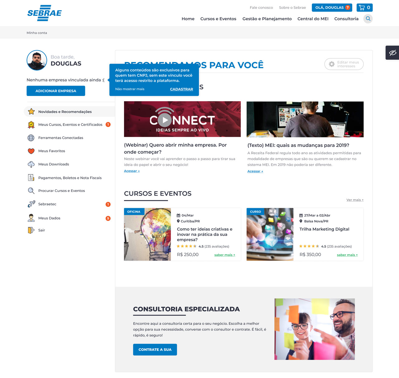
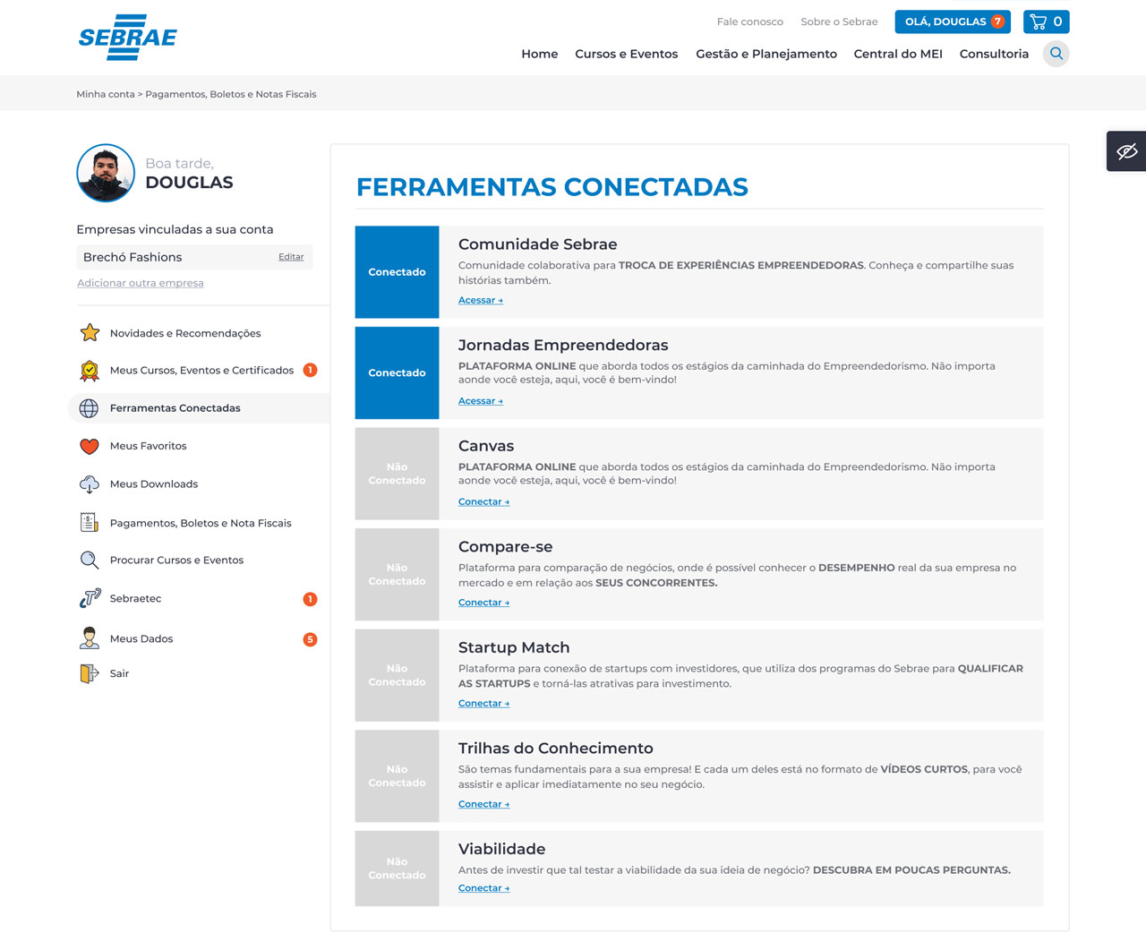
Some of the new account pages features
Account
Connected tools
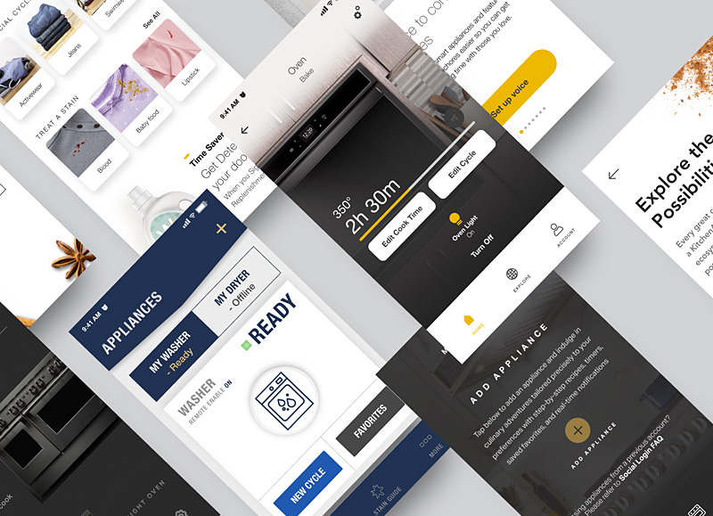 Whirlpool - App IoT
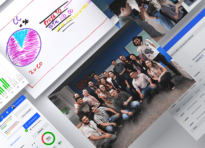 Sebrae - Design sprint